DIGITAL PUBLISHING — DESIGN
TGJ3M1
Magazine Design
Vogue Cover


Overview
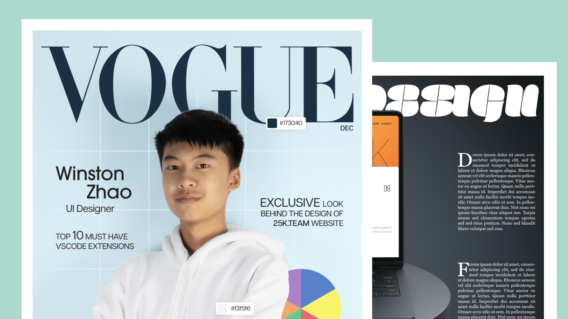
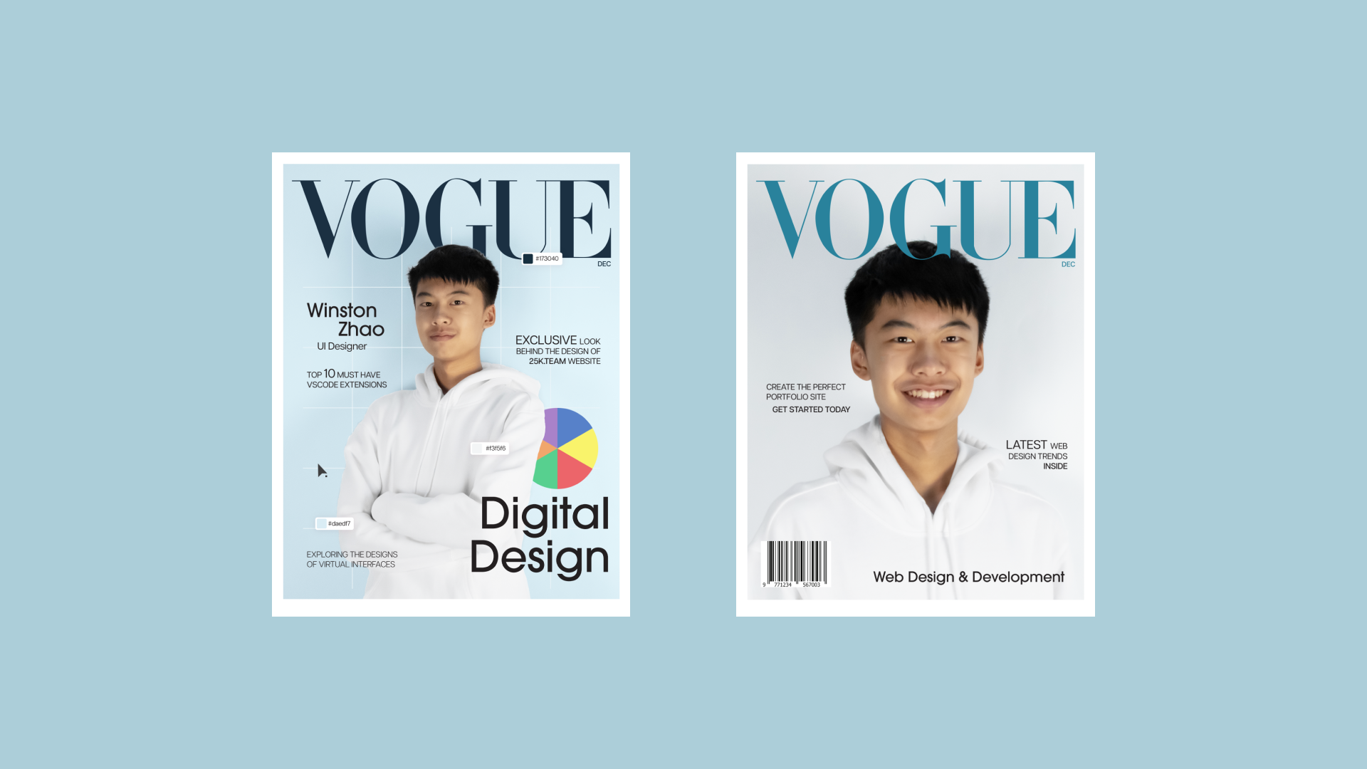
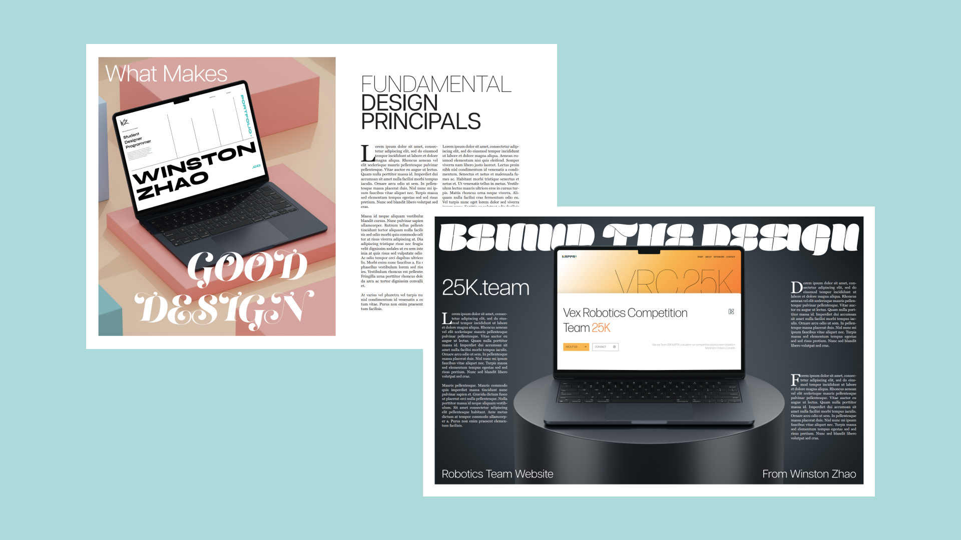
While Vogue is a fashion magazine, this poster bends the rules a bit and talks about digital design. It features a front and back cover with distinct graphics and two spreads. It combines unique fonts with standout colours and backgrounds to compose an aesthetically pleasing page design.
Details


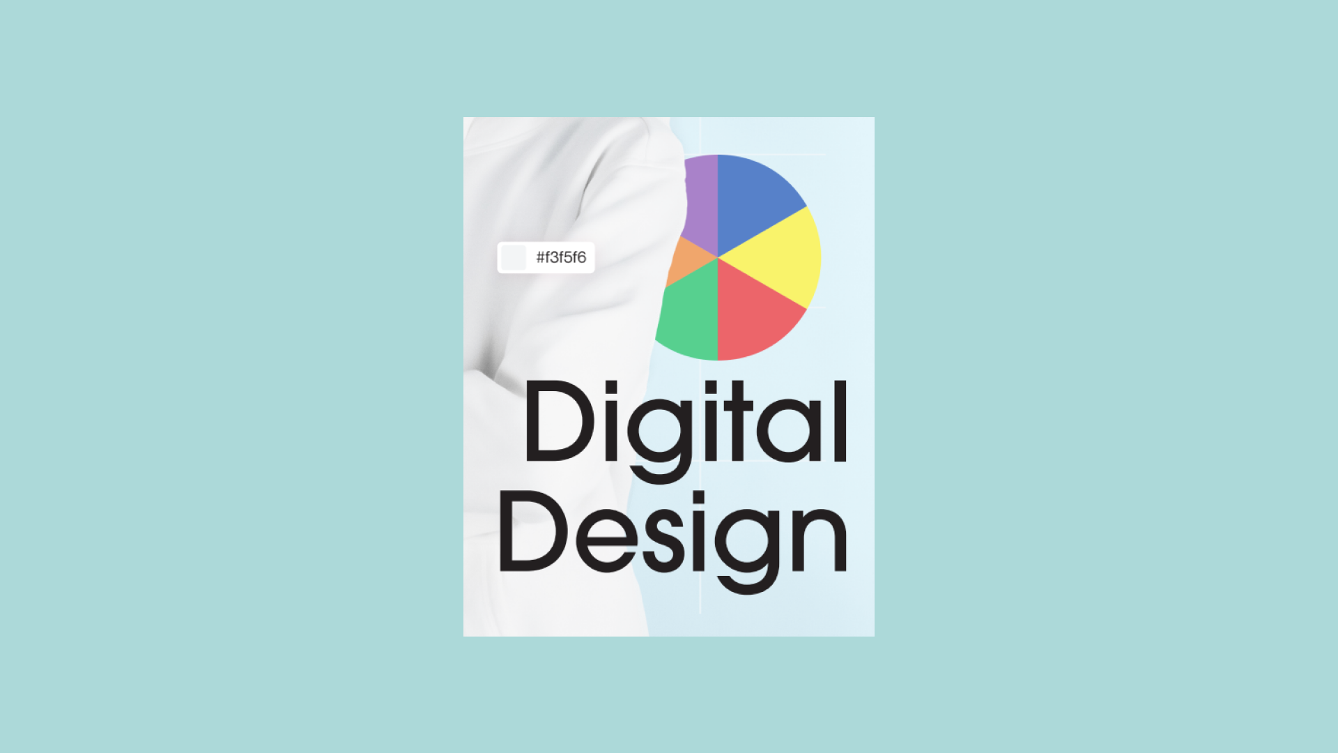
I chose this magazine because Vogue is a cultural magazine, and nowadays digital design is part of the culture people are in every day. It seemed fitting to have design represented as a modern type of culture. The visual style is minimalistic but also fun, with pops of colour and details like the Adobe Illustrator cursor. The target audience is the general public, leaning more towards people who use technology. This is because digital design is found everywhere in normal people’s lives, like in websites, apps, ads, etc.
I chose this portrait because it was one of the good shots of myself that I had access to, and it was shot at school for fun. It has good lighting and also the colour of the hoodie matches the minimalist style of the covers.
This cover has contrast between the text colour and the background of the cover. There is also large contrast with the face of the subject. The large Vogue logo also has a lot of contrast with everything else in the cover. There is repetition in the background, with a subtle grid design symbolizing the grid sometimes used while designing on Illustrator or Figma.